3.7% more engagement by rewriting onboarding for speed and clarity.
Turning confusing questions into confident clicks
As the content strategist on a cross-functional team at Indeed, I led the redesign of onboarding copy to better serve returning job seekers. Through strategic UX writing, I helped reduce cognitive load, clarify intent behind questions, and streamline the flow for speed and relevance. Collaborating with design and research, I shaped content across three experimental onboarding frameworks and contributed to insights that informed six key product recommendations. Our work resulted in a clearer, more efficient onboarding experience and laid the foundation for scalable improvements across mobile web.
Role
Content Strategist
Team
UX Researcher
UX Designer
Product Manager
Deliverables
High fidelity mockups
Prototypes
CONTEXT
CHALLENGE
Returning job seekers expect a personalized, lightweight onboarding experience to refresh their profiles–but the current flow didn't meet their expectations. Our goal was to rethink onboarding to feel smarter, faster, and more relevant, without sacrificing the quality of data collected for matching.
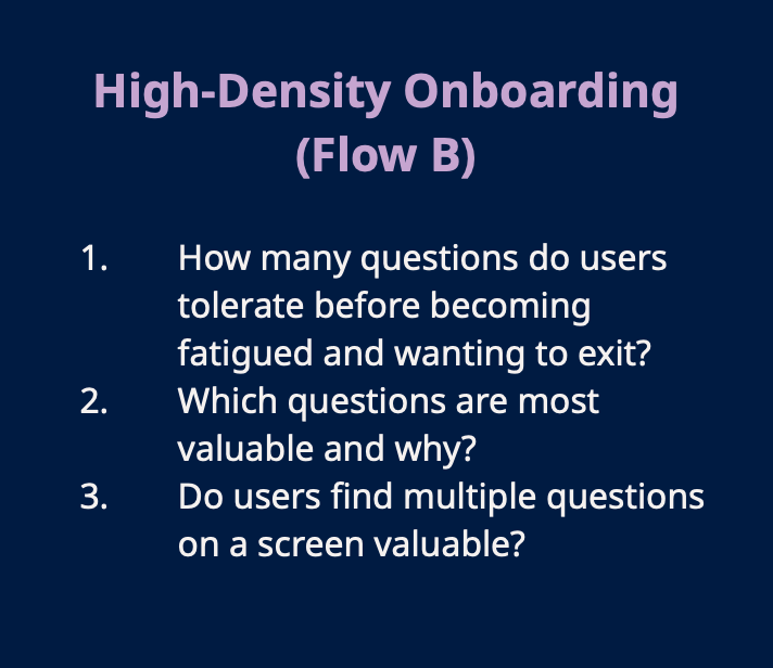
Indeed had already proven that onboarding increased job matching success and engagement, but we hadn’t yet cracked how to make the experience seamless for those coming back after months of inactivity. I joined a cross-functional team to explore three new onboarding frameworks—Assisted, High-Density, and Interactive—and identify which elements we could test and evolve
PROCESS
1. Mapping mental models to content
Job seekers didn’t just want to answer questions—they wanted to understand why they were being asked. I partnered closely with UX research to analyze feedback on the intent, clarity, and cognitive load of each onboarding question.


This helped me rewrite and restructure high-friction moments like:
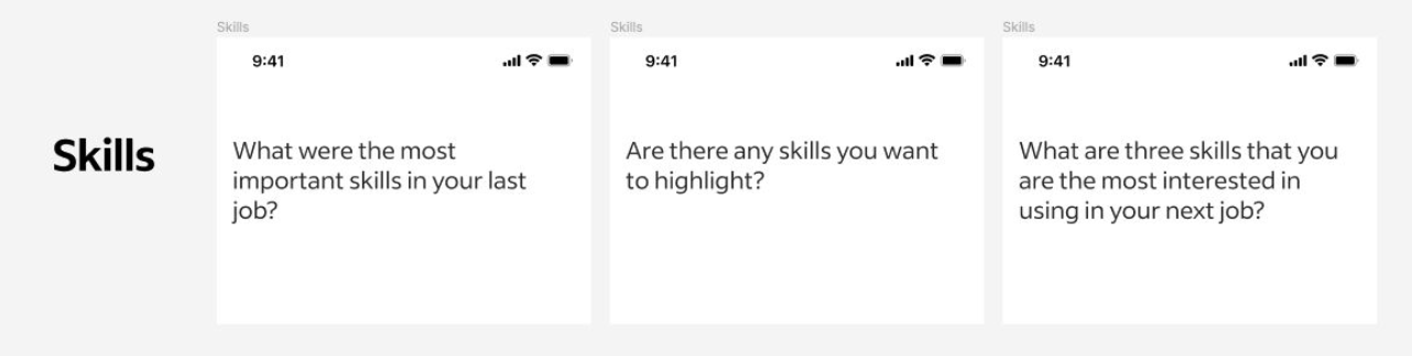
The Skills question (which participants found overwhelming and vague)
I proposed variants like “What are three skills you’re most interested in using in your next job?” to make it feel more aspirational and focused.
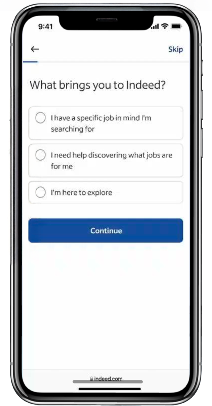
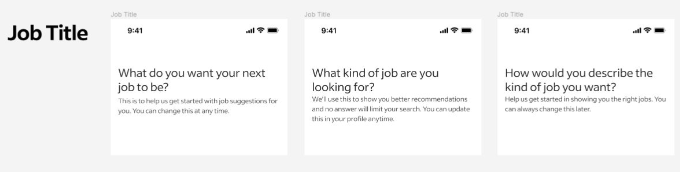
The Job Title question (where users were unsure how specific to be)
I rewrote copy to emphasize flexibility and reduce anxiety: “Help us get started in showing you the right jobs. You can always change this later.”
2. designing content for frictionless flow
Based on research insights, I simplified language across onboarding flows to reduce decision fatigue and enhance momentum. I also contributed content to test concepts like:
Pre-filled responses, to show returning users we remember them and reduce repetition.
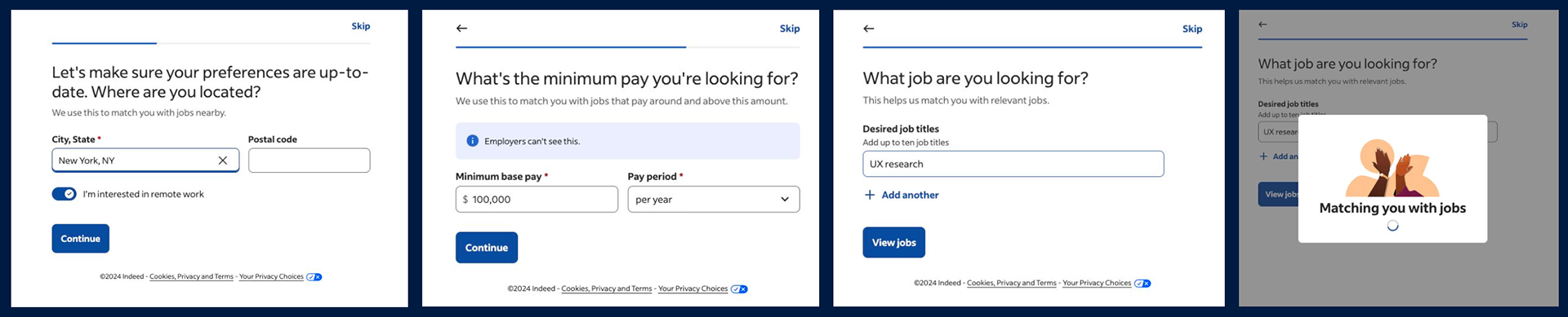
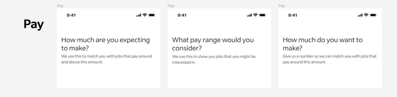
Visual support copy, such as short explanations beneath questions (“We use this to match you with jobs that pay around and above this amount”) to increase trust and completion.


3. collaborative testing & iteration
I worked side-by-side with the UX designer to implement content into interactive prototypes across all three flows. Together with UXR, we tested these flows in moderated 1:1 sessions.
After each round, I revised copy for clarity, reduced optional friction points, and proposed A/B variants for key moments like welcome messaging (which we ultimately recommended removing for returning users).
results
While the study focused on qualitative insights over immediate product rollout, our content-informed recommendations directly shaped the team’s top six product proposals:
✦ Remove the welcome screen: Based on our insight that returning users found it redundant.
✦ Pre-fill questions: A direct response to participant fatigue and content duplication.
✦ Experiment with initial questions: We found that the first question set the tone—especially when phrased clearly and with visible purpose.
✦ Add optional longer flow: Clear opt-in copy gives control back to job seekers without overwhelming them.
✦ Communicate value transparently: Explanatory copy consistently boosted trust and engagement.
✦ Use multiple questions on a screen sparingly: With guidance-driven phrasing, we increased tolerance for high-density screens—up to a point.
reflections
This project showed me that great content isn’t just about words—it’s about surfacing intent, removing ambiguity, and guiding users with empathy. By listening closely to job seekers and iterating collaboratively, we were able to design an onboarding experience that respected both the user’s time and the product’s need for data.
I’m proud to have brought a content lens to a deeply strategic UX challenge—and even prouder that our recommendations were carried forward into future product testing.
Talk to me.